Daily Mail Washington DC - A set of Interactive maps have revealed how the world’s emissions have dramatically changed over the last 160 years.
The fascinating tools reveal how developed nations began to produce huge amounts of carbon dioxide after the Industrial Revolution. And they also reveal how China is quickly becoming the world’s biggest emitter.
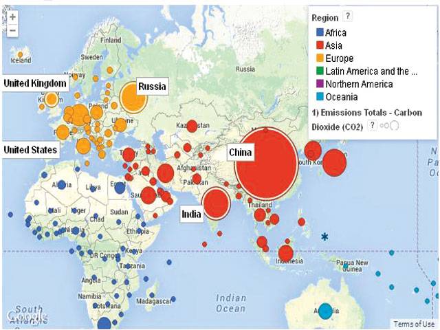
The maps were created by the World Resources Institute in Washington DC. In the first map the carbon dioxide emissions of nations across the world from 1850 to 2011 are shown. And in a second, the per capita emissions of each nation across the same time period are detailed.
The WRI says the total carbon dioxide emissions for the world are nearly 46 billion tons. The largest emitter is China at more than 10.26 billion tons, while the US comes in second at 6.135 billion tons.
The maps were created using the WRI’s Cait 2.0 data, which compiles global emissions data.
This uses climate data from research centres, government agencies and international bodies to measure the emissions of six major greenhouse gases from 1990 to 2011. Carbon dioxide emissions, meanwhile, stretch back to 1850 in 185 countries.
For more than 100 years since the industrial revolution emissions were dominated by the West, but over the last few decades Asia’s emissions have rapidly caught up.
In 2005 China became the world’s largest emitter while several Western countries including the US and UK stabilised their carbon emissions - albeit at a high level.
TOP 10 EMITTERS OF CARBON DIOXIDE
World 45.914b tons
1. China 10.26b tons
2. US 6.135b tons
3. EU 4.263b tons
4. India 2.358b tons
5. Russian 2.217b tons
6. Indonesia 2.053b tons
7. Brazil 1.419b tons
8. Japan 1.17b tons
9. Canada 847m tons
10. Germany 806m tons